GOOGLE FEM
Empowering women to manage their health on the go
Introducing a future Android app that puts women’s needs first

Background
Women’s Health in Context
Women make 80% of the household healthcare decisions and spend 29% more than men on healthcare needs. With all that spending and decision-making power, It’s hard to believe how underserved women are by healthcare innovation.
For years the healthcare gender gap has been wide, with few products designed by women or focused on women’s health and a severe lack of investment (3% of US digital health funding since 2011 went to women’s health startups).
With a dearth of products and resources to help make informed, evidence-based health decisions, women often resort to troubleshoot their issues through online searches, piecing together information that can be inconsistent, confusing, and lacking credibility, which is so critical when it comes to one’s health.
FemTech Takes the Stage
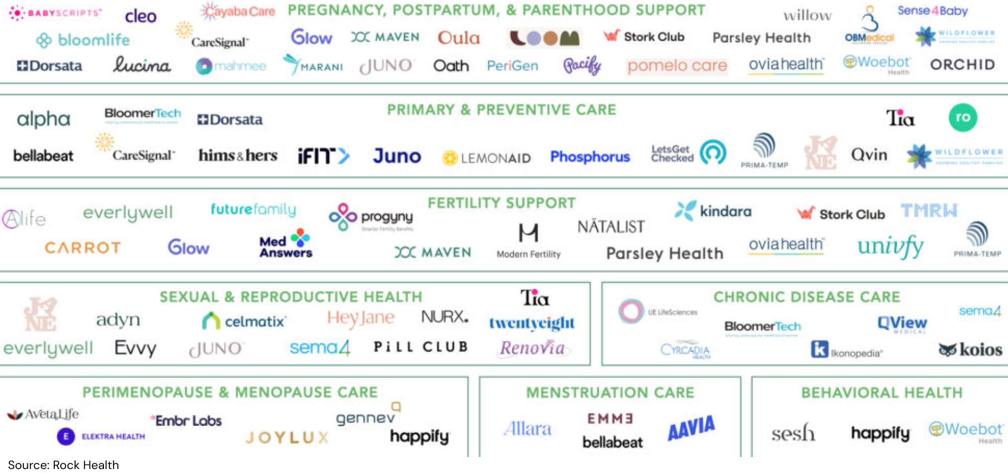
Against this backdrop, FemTech has emerged as a growing sector of digital products and solutions designed to improve or support women’s health — estimated to be worth $50 billion by 2025. There were about 1,800 FemTech companies and startups in 2022.
“When I experience health symptoms, I Google everything. But with all the misinformation online, I take it with a grain of salt.”
— Claire, 31
A Google Challenge
Recognizing an opportunity for Google to expand its offerings into the rising FemTech market, I created an Android prototype and branding for Google Fem, a new women’s health app as an inclusive futures project. Excited by this challenge to make women’s health more accessible, I spearheaded a UX design process from a concept through developer-ready prototype.
Expertise: UX, UI, User Research
Team: UX Designer (me!)
Tools: Sketch, Invision, Airtable
Deliverables: Interactive prototype & Branding
Learning the Landscape
To gain a broad understanding of the FemTech space and define our target users, we kicked off our design process with market and competitor research. Our findings helped us identify certain pain points and characteristics of our target audience, which we’d delve into much deeper during user interviews.
Market Trends
Something that stood out to us during this research phase was that women are digital health super users: they make up 62% of health and fitness app users overall, engage with digital health products 75% to 85% more often than men, and spend three times longer interacting with them.
But not without pain points: privacy issues, inaccurate predictions, and the perception that women’s health features are add-ons.
FemTech Trends
• High visibility brands that target Millennials
• Products expanding beyond reproductive health
• Apps targeting women at all ages & stages i.e. hormones, menopause
(Sources: Forbes, FemTech Focus, Frost & Sullivan, Rock Health, U.S. Dept. of Labor)
Sizing Up the Competition
When conducting competitor research we noticed that period and ovulation trackers were the most popular types of apps among women, with Flo and Clue leading the charge. In addition to noting the characteristics, strengths, and weaknesses of these apps, which we considered our direct competitors, we looked at the most popular health and wellness tools, including Fitbit and Apple Health, to gain insight on some of their best practices and user patterns.

Identifying Our Type(s)
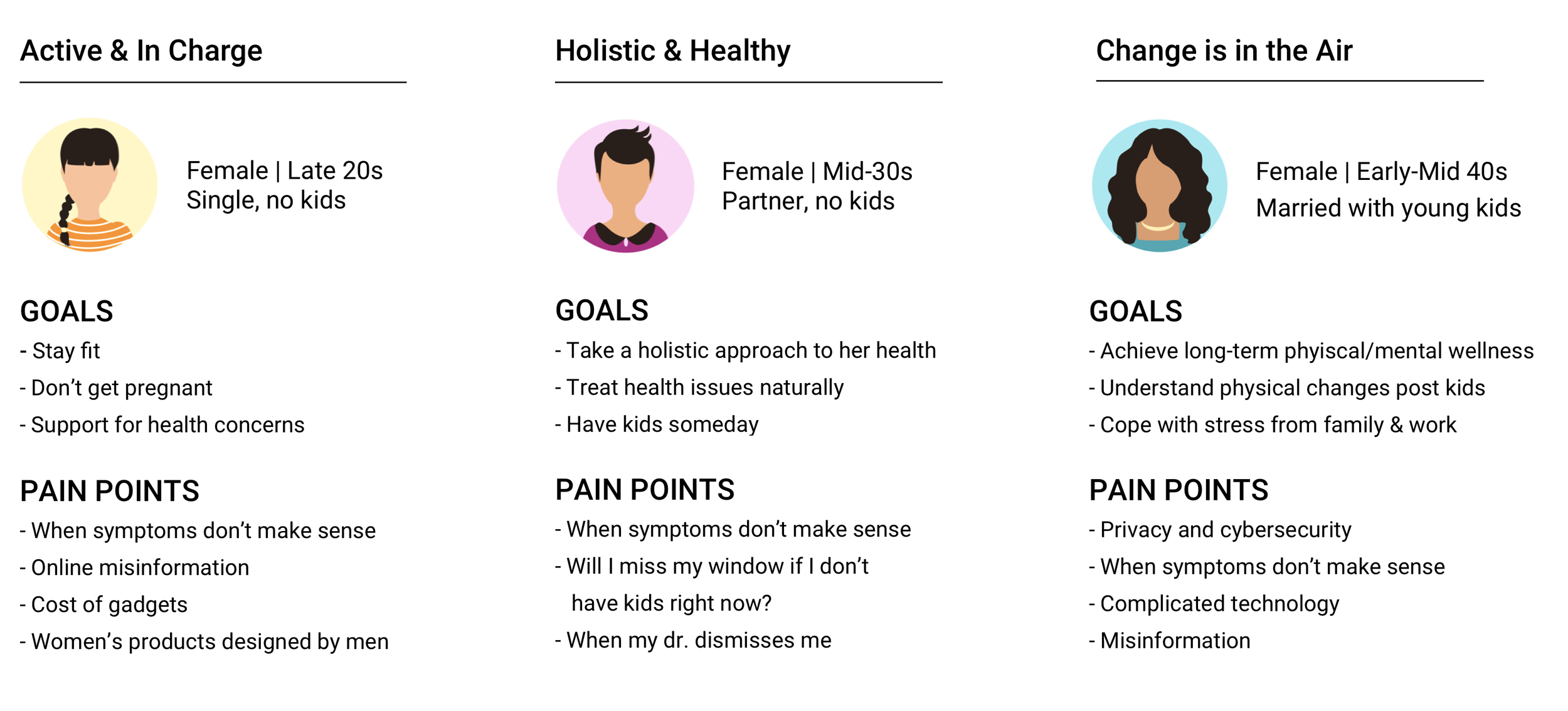
To guide us in our selection of users to interview, we created three target user archetypes that were based on the demographic information pulled from market research (see below).
Woman in her late 20s to early 40s
Mid to upper income
Urban or suburban
Use or have used mobile health apps
Turning Empathy Into Insights
From start to finish, we were committed to keeping women’s needs and priorities at the heart of the design process. In order to empathize with the behaviors, motivations, and pain points of Google Fem’s target audience, we conducted one-on-one interviews via Zoom with five women who fit our user profiles. We felt that using open-ended questions was especially important given the private nature of health topics and were delighted to find that interviewees were very open to sharing their experiences with us.
Key Questions
What are users’ concerns and frustrations related to digital health apps?How do they seek health information?
Where do they go to for support around their health issues?
(That’s me conducting user interviews on Zoom
Putting Her Needs First
The interviews validated our assumptions that: current women’s health apps are not meeting users’ whole health needs; users want valuable and credible health information from their digital tools; health apps need to be easy to use.
We identified several significant pain points. Some were unique to digital platforms, while others represented frustrations with the healthcare system in general. For instance, all of our participants shared experiences of feeling dismissed by their doctors around a health concern, and there was a consensus that there was a stigma surrounding women’s health - emotional/mental health in particular.
“You feel alone.
You think something must be wrong with you.”
— Noa, 29
With more than 200 Post-it notes worth of observations, we synthesized and categorized the data by using an empathy map (see below), helping us to define three overarching themes: credibility, connection, and ease.
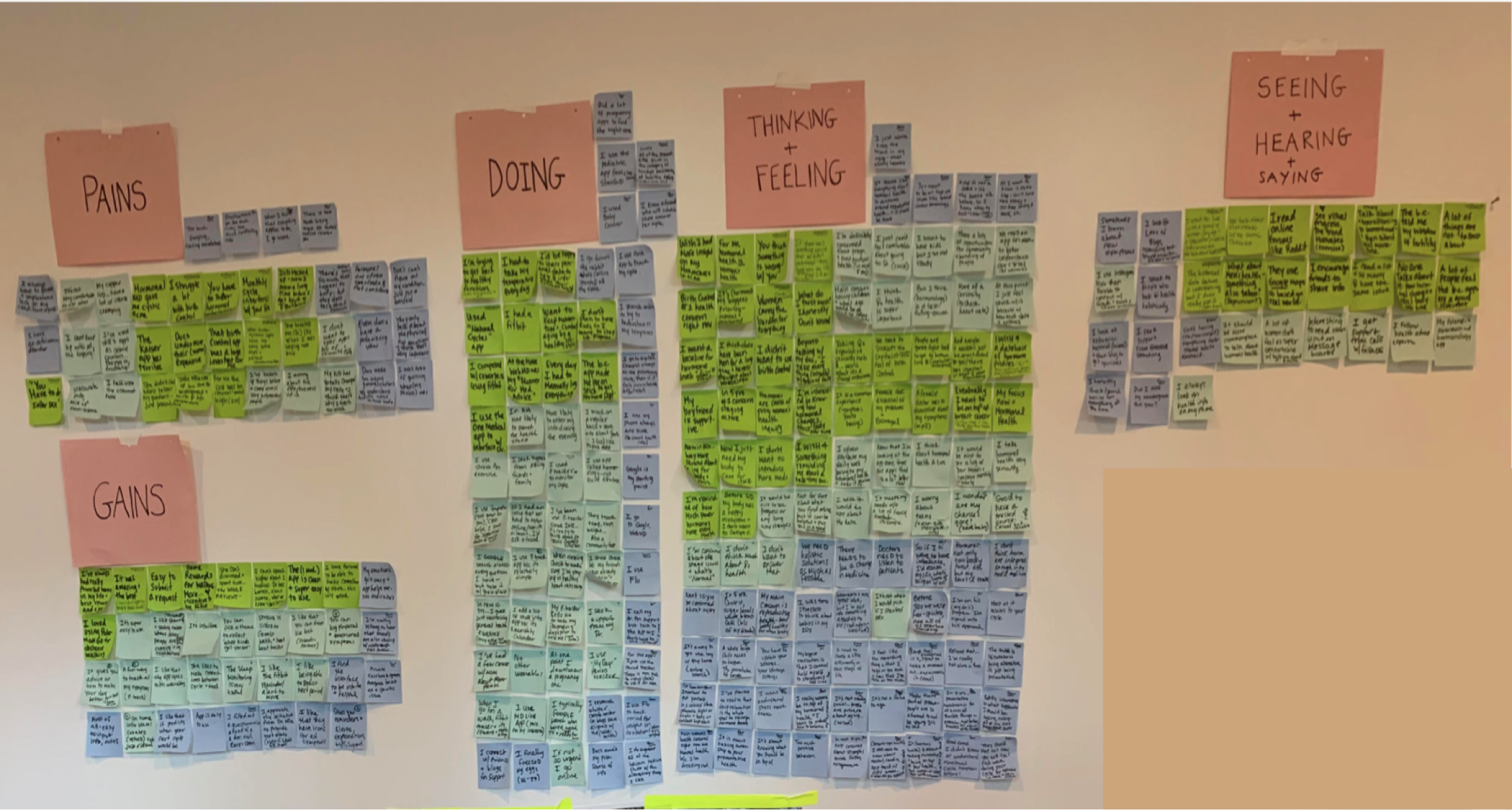
Patterns & User Needs
• Credibility: Users struggle to find credible resources on women’s health issues - they need to be able to find health information they can trust.
• Connection: Users believe people don’t talk enough about women’s health. They need to be able to connect with others facing similar symptoms.
• Ease: Users find it frustrating when health apps require too much manual input. Users need to be able to manage their symptoms with ease.
Google Fem Personified
The user insights gleaned from our empathy research served as the foundation of Google Fem’s design. We personified the goals, needs, frustrations, and motivations from our interviews into the user profile of Daphne Johnson. This user persona would inform our product design strategy and design decision-making moving forward.

Plotting a Product Roadmap
With our research findings as a launchpad and Daphne Johnson as our Northstar, we generated possible solutions by implementing group ideation sessions and mind-mapping exercises. After compiling a multitude of ideas for addressing Daphne’s needs, we reexamined the clients goals from the project brief.
Juxtaposing user needs with business goals helped us consolidate our input into three overarching areas of focus, which would inform the features, flows, and functions we’d prioritize in our design:
Track symptoms
Contribute to users’ overall wellbeing (physical + emotional)
Easy to use

These project goals helped justify the “must-haves” when making our product requirements decisions, which are called out in the product roadmap below.

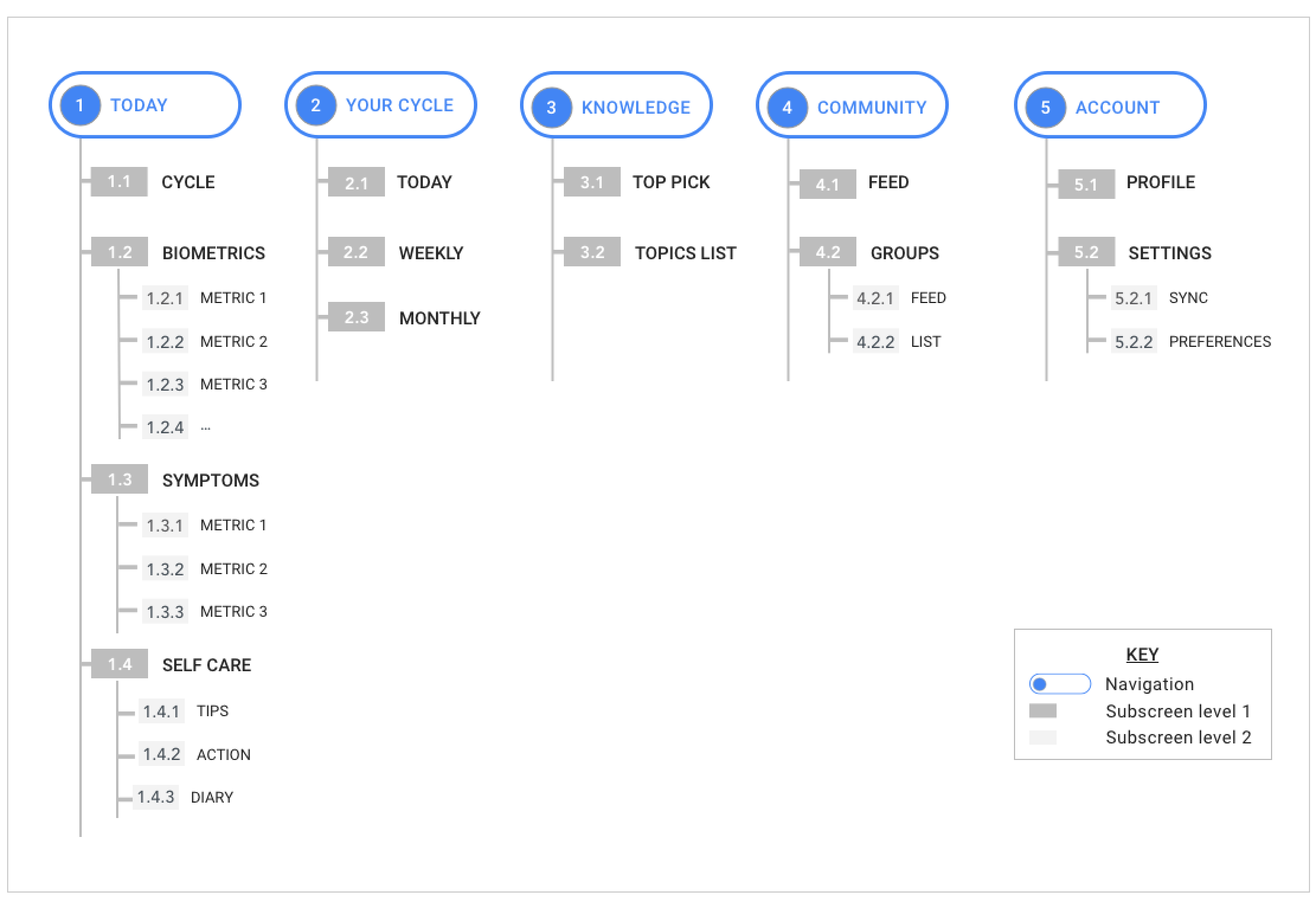
Mapping It Out
With the priorities defined, we set out to organize these features into a sitemap, which laid out the information architecture/hierarchy of screens and features in a way that we believed the user would find intuitive and logical.
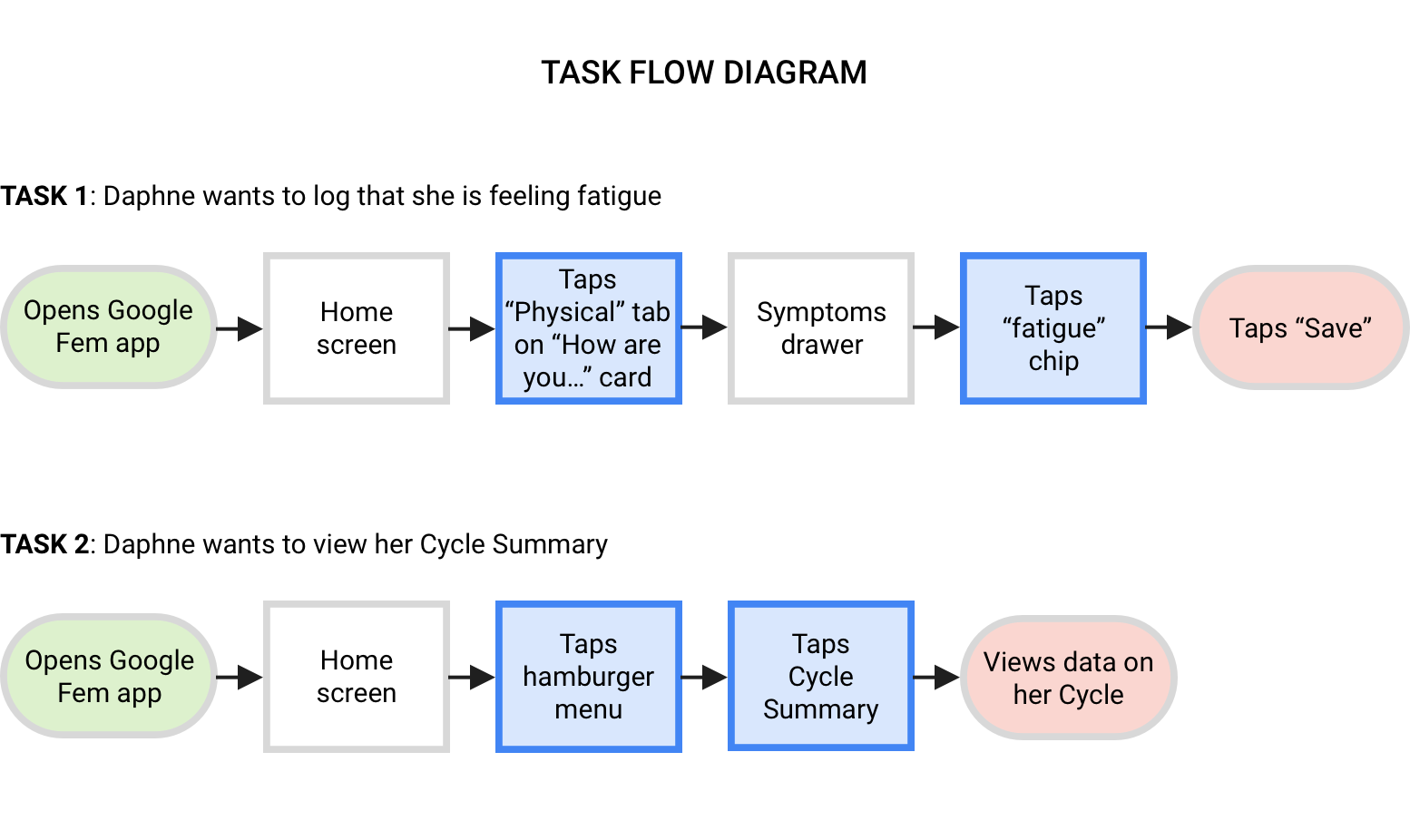
User Interaction
With the information architecture in place, we began to visualize how the user would interact with the different features of the app. We crafted task flows to illustrate how a user might navigate through the app given different scenarios, and user flows which include decision making points, which take into consideration what Daphne might be thinking and feeling as she interacted with the app.
Ready, Set, Iterate
With the product roadmap informing even the earliest stages of wireframing, we first sketched out some of the main screens and features.

UI + Google Material Design
Since we were working on a new Google product, understanding Material Design guidelines was a critical phase of the project. We experimented extensively with Material Design’s UI patterns and components we felt would be most effective for our user tasks (e.g., cards to display important content and functionality and modals and chips for symptom tracking, and toggles for on/off settings).
Our UI decisions were also informed by our competitor research, as we referenced common elements of popular health apps and Android patterns that would be familiar and intuitive to our audience (with our user persona, Daphne, in mind).
Bringing Features to Life
Our next round of iterations were created in Sketch. These digitized (mid-fidelity) wireframes incorporated the more refined UI components and content, and were starting to look like a real Google app! We decided this was a good time to pause and get the prototype in front of real users.
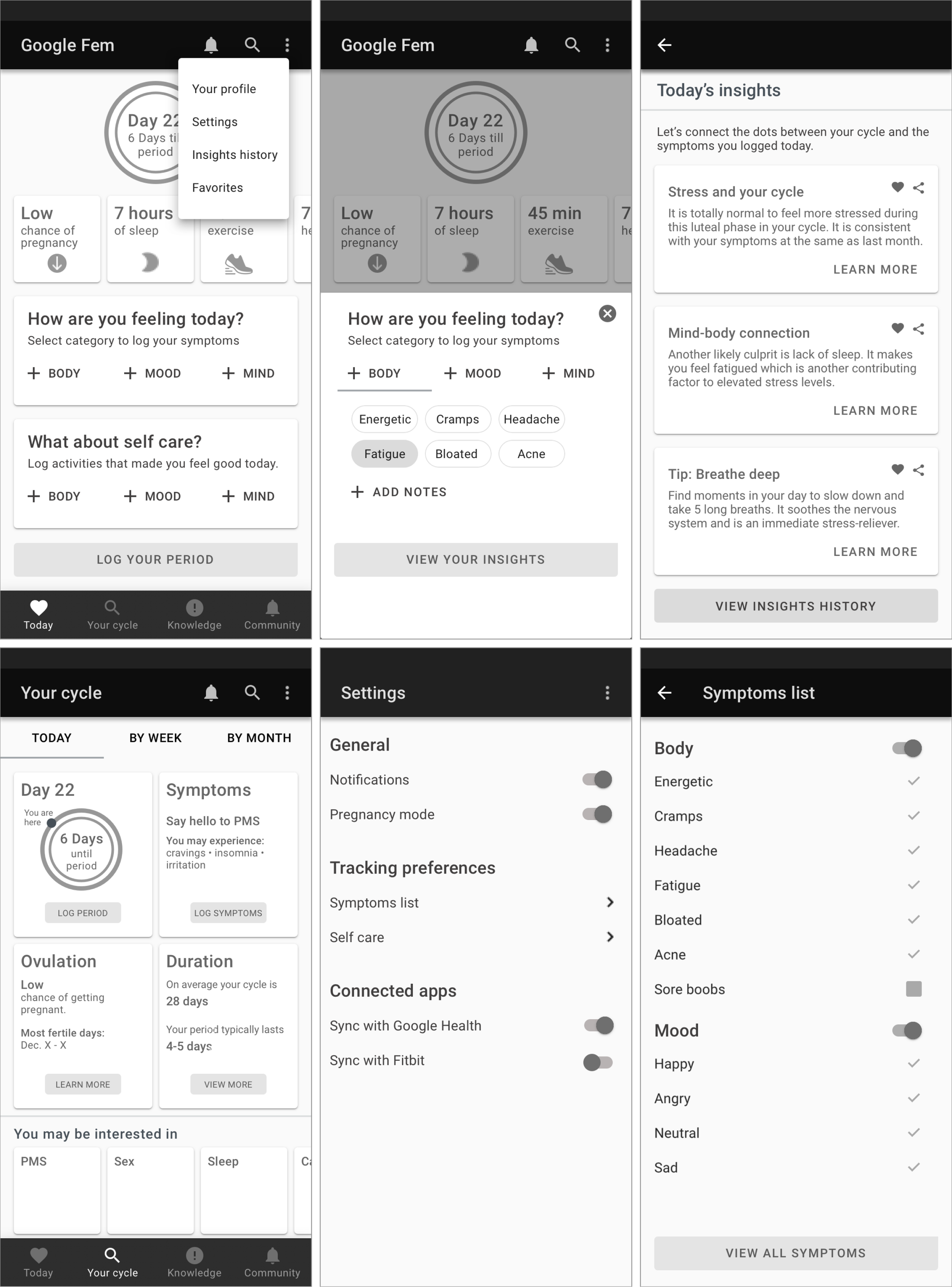
We added in more section details that emphasized a holistic approach to tracking physical and emotional symptoms as well as some product requirements “must haves,” including a Settings screen.
How User-Centered was Our Design?
In general we’ve found that user testing early and often is a good investment of time and resources; it helps us answer some big questions about usability and functionality, and prevent us from getting too far into the weeds before we validate our assumptions with actual target users, and it’s also an was also an efficient and effective way to hone in on the areas to improve our design.)
Testing with Real Users
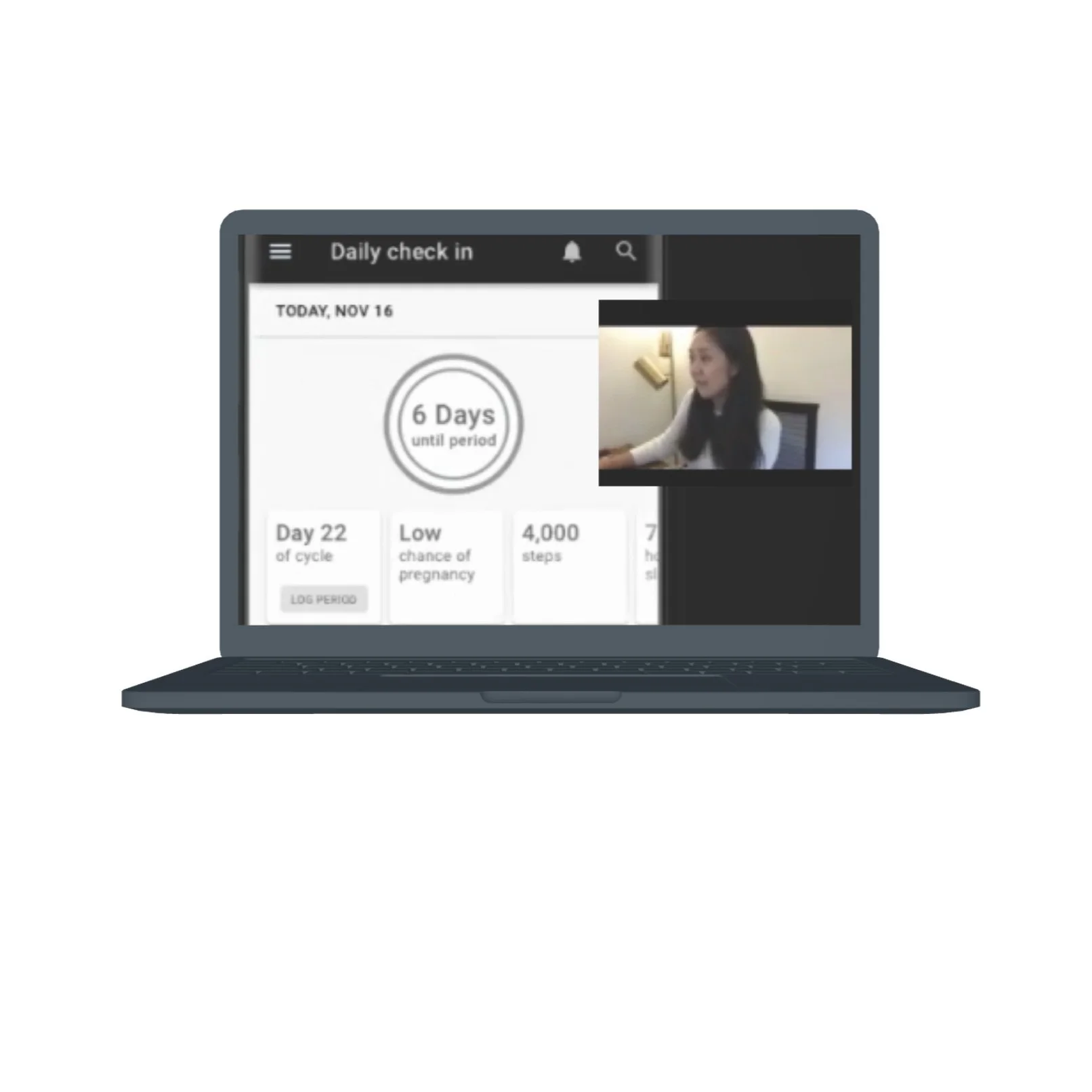
We conducted user testing with four women in their early 30s to mid 40s who were Android users. Employing the moderated, think-aloud method, participants were asked to complete a series of tasks and share what they were doing, thinking, and feeling as they interacted with the prototype while we observed their actions remotely via Zoom.
Key Questions
How easy was it to complete tasks and how efficiently could they perform them?
What errors were made and how easily were users able to recover from them?
How pleasant was the app to use?
(Screenshot of user test in progress)
Pros, Cons, Priority Revisions
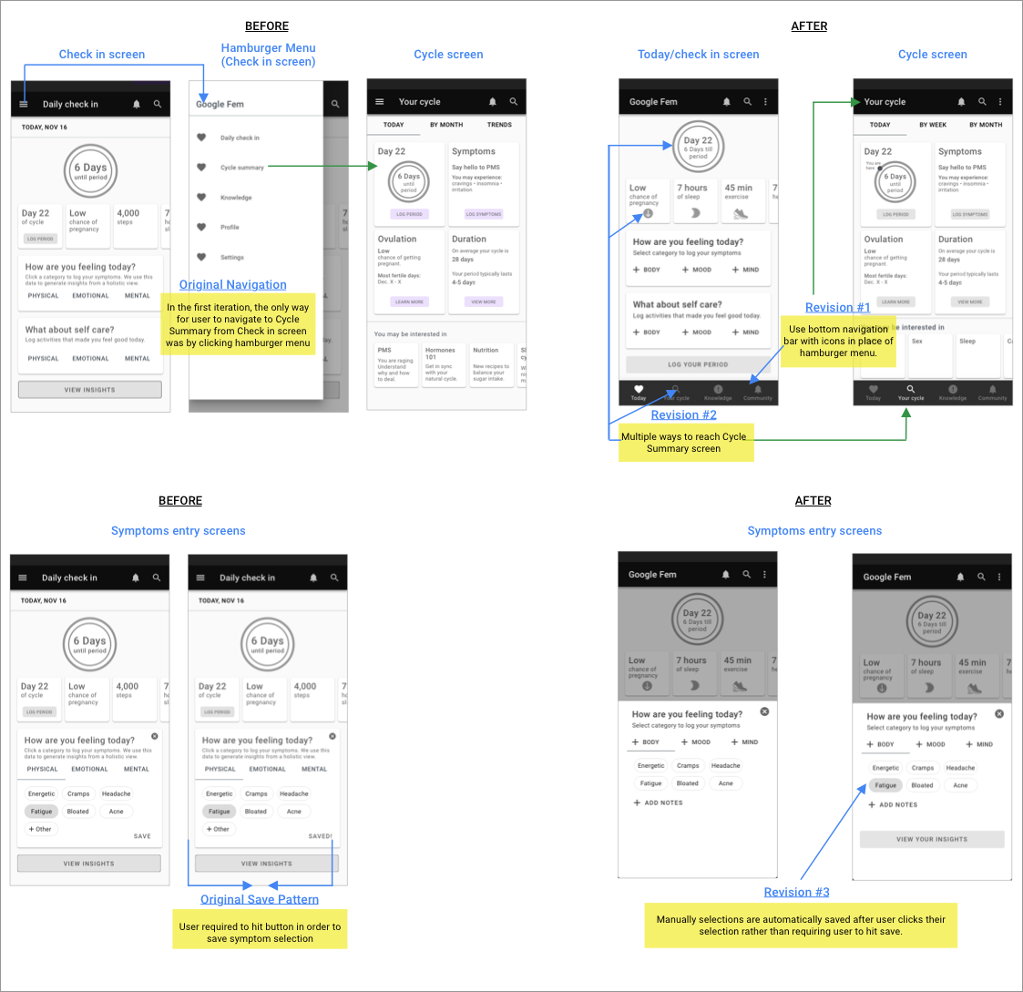
Users reacted positively towards features and content like the tracker, cycle summary page, and insights. But we also noticed that certain elements caused confusion and frustration, including the primary navigation pattern (hamburger menu) and lack of an autosave function.
By synthesizing the comments and observations into an affinity map, we were able to zero in on patterns and prioritize the improvements we should incorporate into the next iteration of the design. A sample of our post-user testing revisions are shown below.
Branding, UI Design System
Visual Design and Branding
Our intention was to create a brand identity that would strike a balance between the Google look and feel, including its trademark color palette and geometric style, and unique qualities that would resonate with Google Fem’s users. We anchored Google Fem’s visual style in brand attributes - Warmth, Energy, Trust, Connection - and drew inspiration from popular women’s health brands.

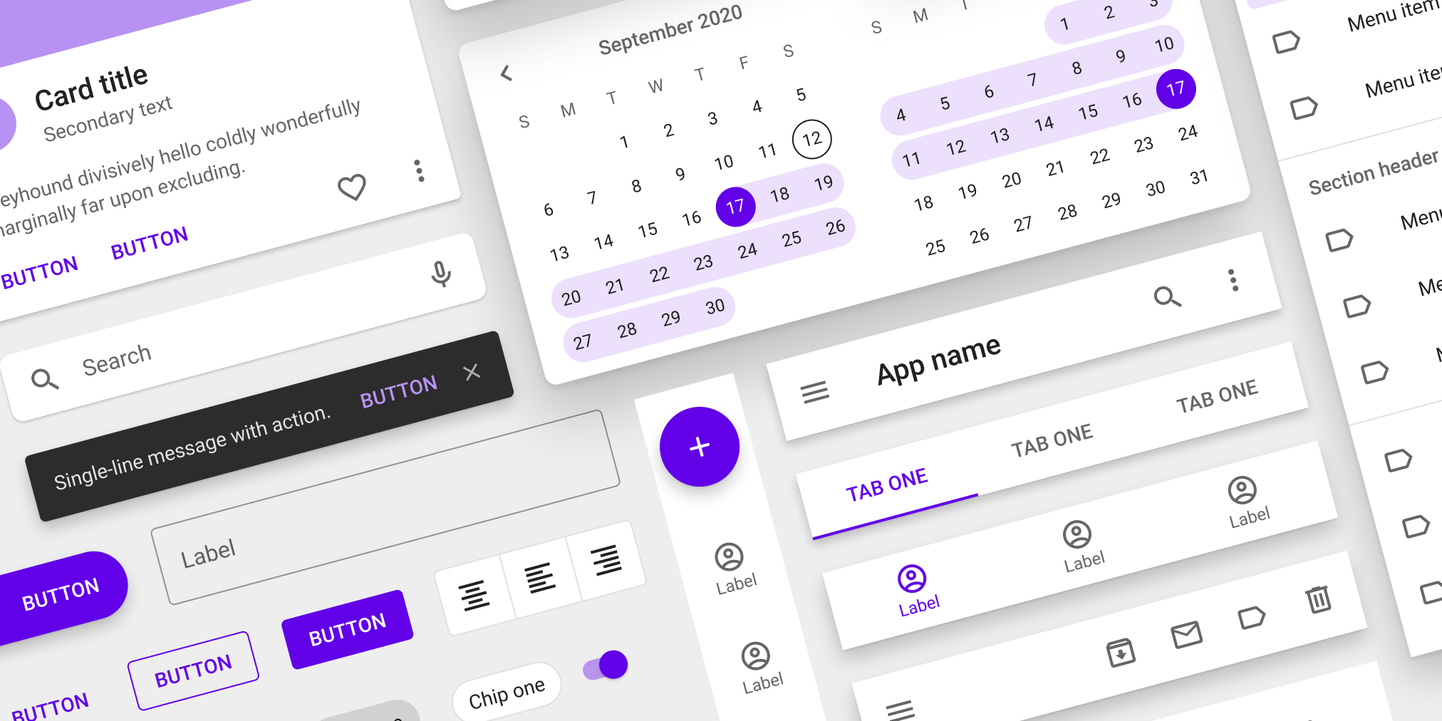
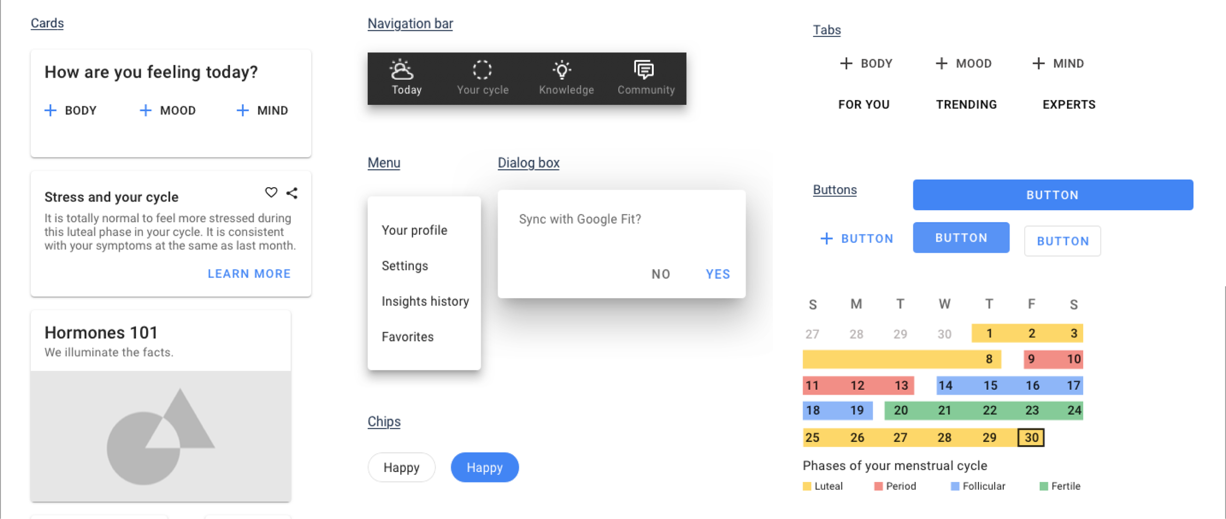
Our Design System
Once the styling elements and UI were validated by our users, we combined all of the components into a single global design system (see below). The goals and benefits of this Design System include:
1. Assist with cross-functional communication between Design, Product, and Engineering teams
2. Improve efficiency of app developers when implementing designs
3. Clarify how components and styling are to used across the app
4. Ensure that visual guidelines will be implemented consistently across all future design iterations and revisions
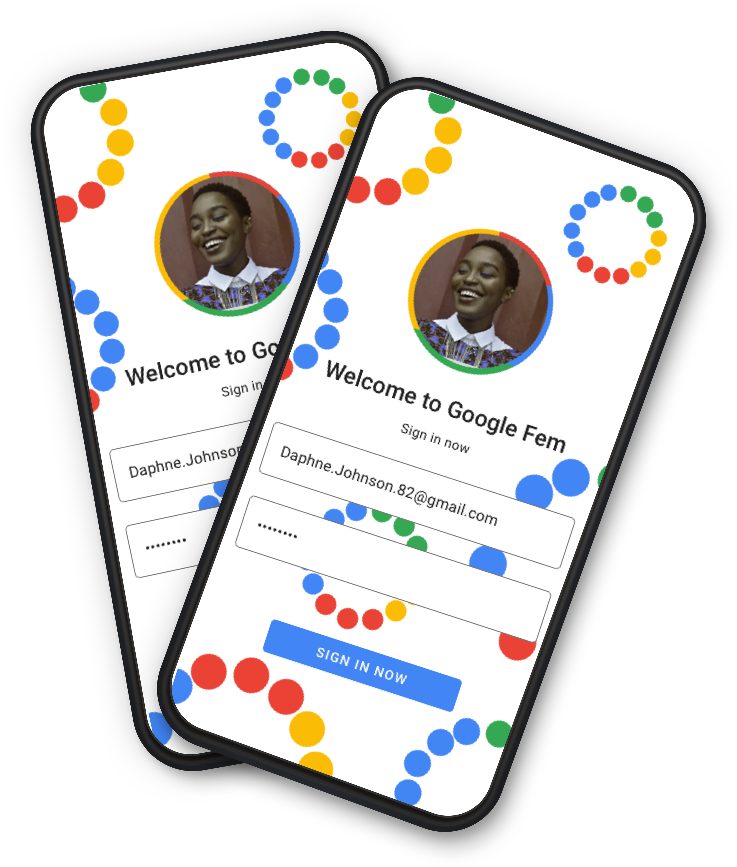
Presenting Google Fem!
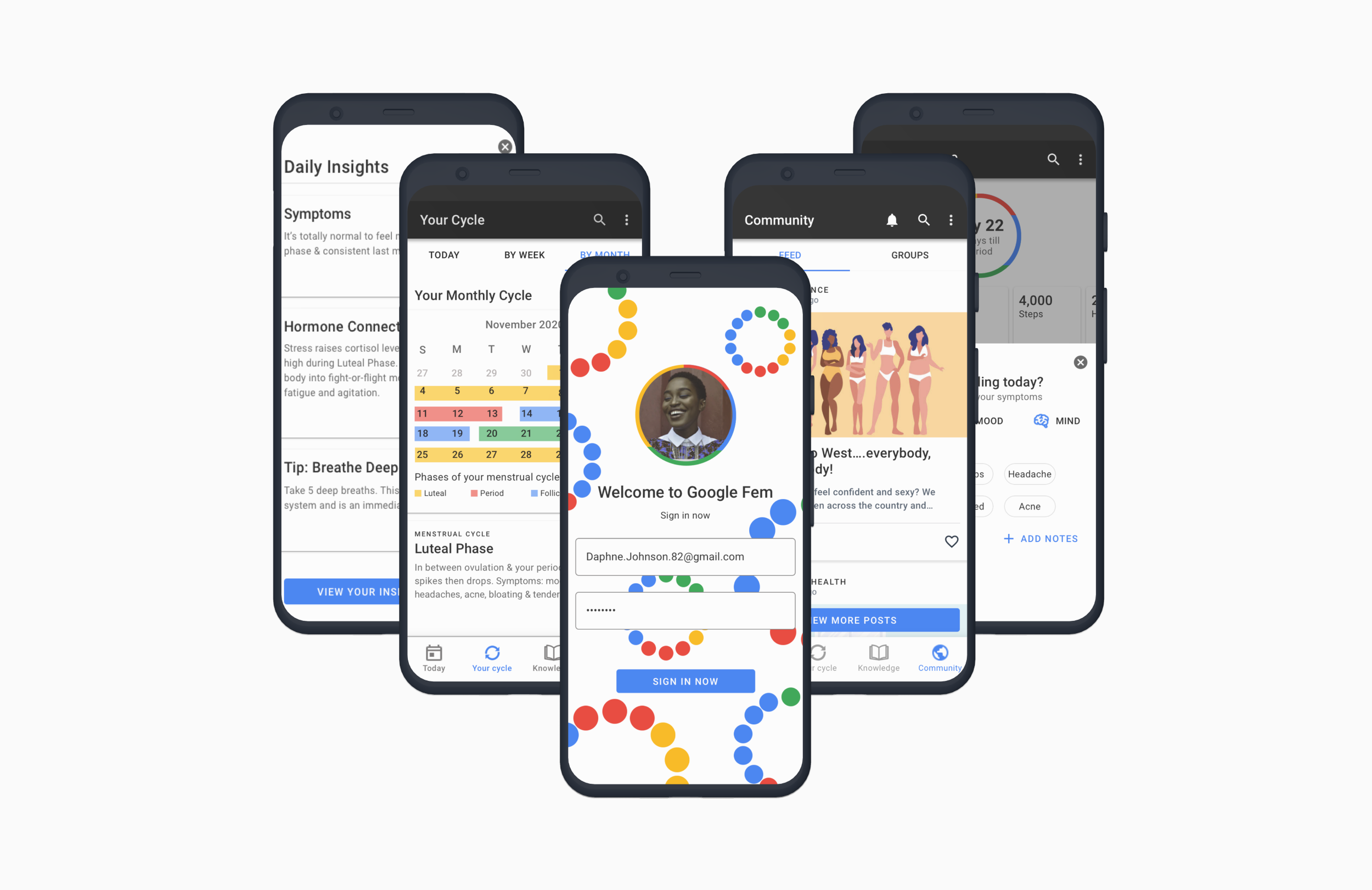
Final Design
With validation from two rounds of user testing, we were confident we had designed a valuable, easy-to-use, digital health solution for women seeking support and credible information about their health issues. The last step was to design high fidelity wireframes and a final Google Fem prototype. This was the culmination of our end-to-end design process from empathy and discovery to ideation to iteration.
Google Fem was thus ready to be presented to the client and handed off to developers for implementation.
Knowledge + Cred
The final design incorporated additional screens and content to enhance Google Fem’s value to women seeking credible information with a Knowledge section as a main navigation tab.

Community + Connection
Additional features included a Community section to facilitate connection with others experiencing similar symptoms through groups and forums about key topics that came up during our research.

Reflection and Next Steps
Google Fem was simultaneously one of the most difficult and rewarding projects I’ve ever worked on. There are many reasons for this:
While any health-focused product will inherently involve sensitive content, women’s health encompasses some of the most personal issues imaginable.
I represent the target audience, which I found to be both a limitation in terms of my own bias and an advantage when empathizing with users’ experiences. My self awareness helped keep my bias in check as the design process unfolded.
My ability to develop credible content (credibility was one of the user goals) was limited given that I am not a clinical expert. Thankfully in a real-world scenario, I would partner with subject matter experts to develop accurate and evidence-based health information.
In future iterations of the design, I would explore opportunities to:
Integrate a Search feature specifically for the Knowledge section that would serve the purpose of Google searching women’s health topics
Collaborate with subject matter experts to create evidence-based content
Conduct further user testing for input on the final visual design