Phase 2:
BETA VERSION
Our primary objective for the beta version was to deliver a simplified version of the app to a select pilot group of members. This user feedback was instrumental in guiding me with the final design and optimizing the app's performance before its wider release.
To achieve this goal, we set a tight timeframe of 12 weeks as a close collaboration between the product, design, and engineering teams, broken down into two-week agile sprints.
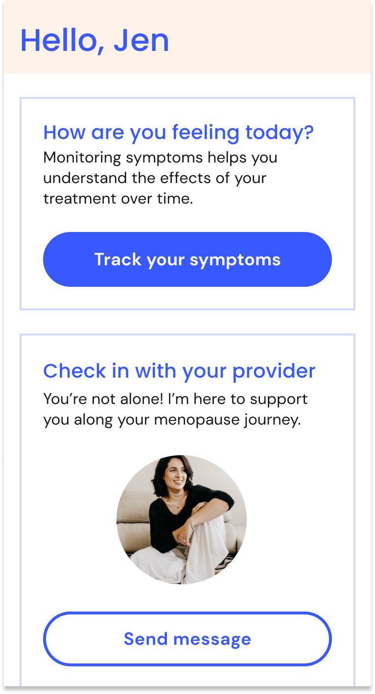
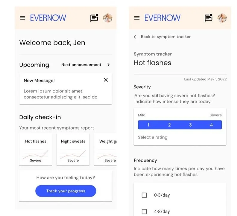
In the first month, our primary focus was to address any structural unknowns, with specific attention given to refining the design of the symptom tracker feature and making asynchronous communications via text messaging with providers as seamless as possible.
Challenges + Limitations
Amidst the aggressive timeline, our cross-functional team faced experiential and technical challenges. For instance, because our engineers were newcomers to the app space, there was a learning curve on the backend as they rapidly acquired news skills. In addition, because were were a lean fast-paced startup, we encountered competing priorities, which at certain times required adaptability and a shifting of priorities. Specifically, I had to balance the demands of shipping a beta version with new pay model initiatives, product launches, and web experience enhancements.
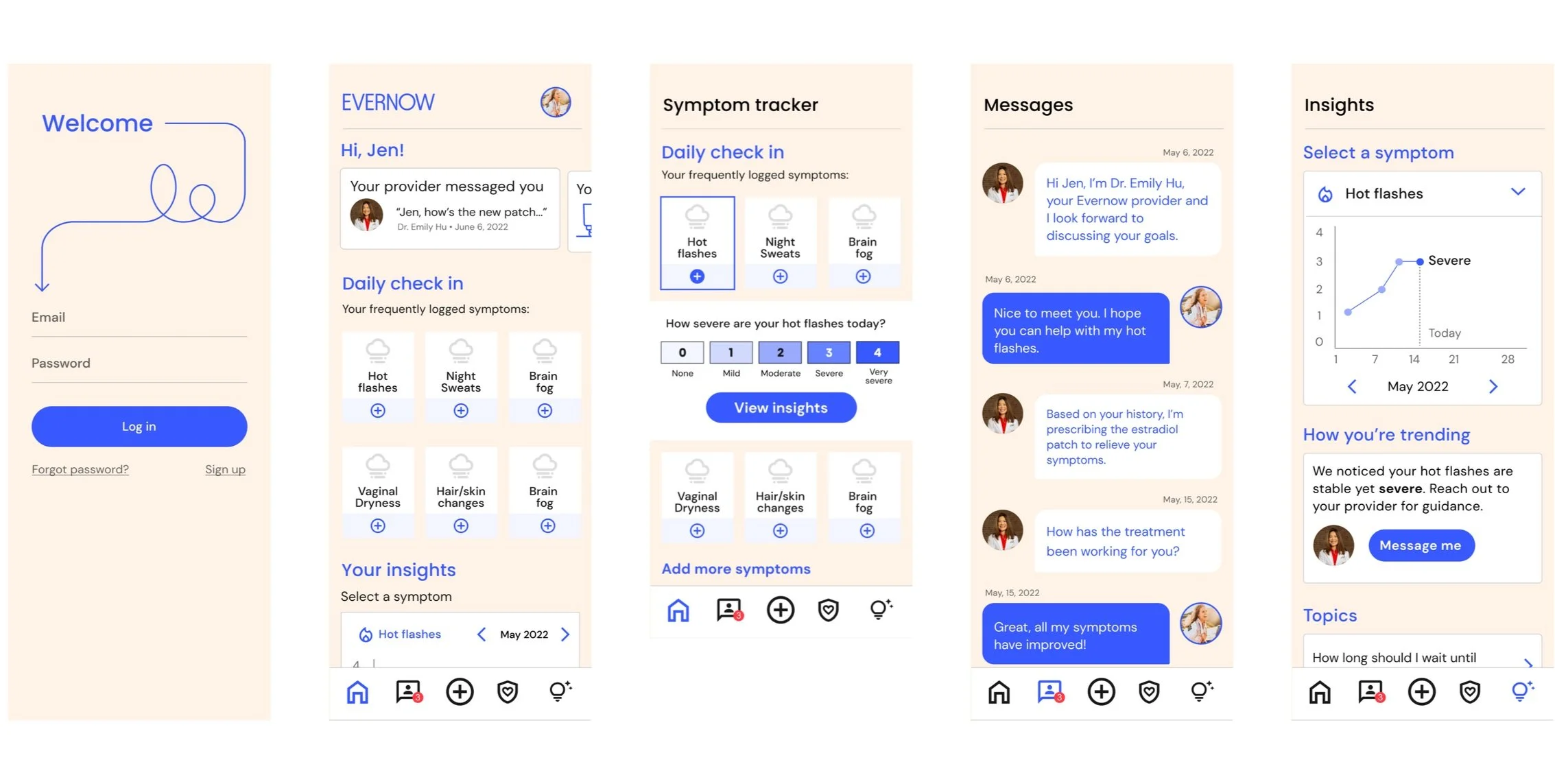
We prioritized the symptom tracker and messaging features for the beta test.
#1 Most Valuable New Feature
We knew going into the design phase that a symptom tracker was a “must-have” feature, involving complex functionality and structural unknowns. From content strategy and UX design perspectives, we needed to strike a balance between user-centeredness, clinical considerations, common patterns, and of course, technical constraints.
Symptom Tracker Interaction Priorities
Decisions about the user interaction of the symptom tracker were also made based on common patterns from popular health tracking apps. We determined that at a minimum, the tracker should allow users to:
• View their frequent symptoms
• Rate their symptom severity
• View the data they log over time as a line graph
Validating Assumptions = Priceless
As the engineers were getting up to speed on the backend and react native, I continuously iterated and tested prototypes with our target audience via Usertesting.com in advance of the beta release. This proved to be an efficient and effective method to helping me work through some of the functionality and visual design of the tracker along the way, so that by the time it got into the hands of our pilot members, I felt confident that the design had been informed and validated by input from their peers.
By beta launch, I had conducted several user tests, integrating feedback into each subsequent iteration.
Release the Beta!
Participants of the beta test were recruited through an Evernow member newsletter posting. Of the 25 respondents to the post, 14 beta users installed app, and used it consistently for 1-2 weeks. I conducted six one-on-one interviews with participants via Zoom. We were specifically interested in getting feedback on the following key questions:
● How is the symptom tracker used in real life scenarios?
● How do users respond to their own data?
● Does the symptom tracker UI/UX promote regular use, create user delight, and give the user a feeling of agency? If not, what needs to change?
● Does messaging work as expected?
● Are there any major bugs?
● What ideas should we consider for the future?
A sampling of beta app screens
Key Findings
Based on the discussions with members, I noted the need for improvements in the UI and visual design of the symptom tracker. Users also expressed desire for some more advanced features that we could consider in the future. Other than that, the feedback was overwhelmingly positive in terms of features, content, and functionality.
Positive Feedback
● Users like that the app is simple, straightforward, and friendly
● Felt overall, very quick and easy to use, preferred over web experience
● Indicated there's value in seeing symptom severity change over time
● Liked viewing insights that were specific to their symptom trends (when they found them)
Errors and Frustrations
● Minor design/UX issues such as confusion over whether their entries were saved or not
● Colors and visuals were not exciting or “feminine”
● Most had difficulty finding the insights section without being prompted
● Frequency of use decreases when symptoms are not severe (indicates need for more incentives to engage with tracker)
More feedback
● Perception that their menstrual cycles were connected to symptoms for most users
● Tracking frequency is dependent on type of symptom, severity, and the user’s preferences
● Planned to use it as a discussion tool with provider
● Would like to be able to see more correlations between symptoms and/or triggers
● Desire for additional features: period and weight tracking, reminders to track symptoms, edit or track a previous day, medication reminders


