Phase 3:
LAUNCH + BEYOND
Final Sprints
Entering the final stage of the hi-fidelity design, my focus was to address the functionality issues identified during beta testing and solidify the visual design of each screen. What follows is a sample of improvements and visual design and UI specifications that I passed on to developers for final implementation.
Visual Design
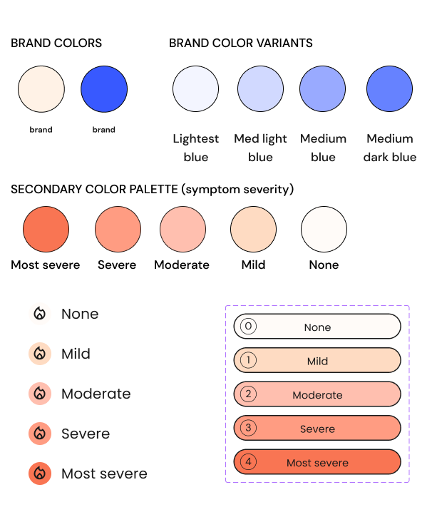
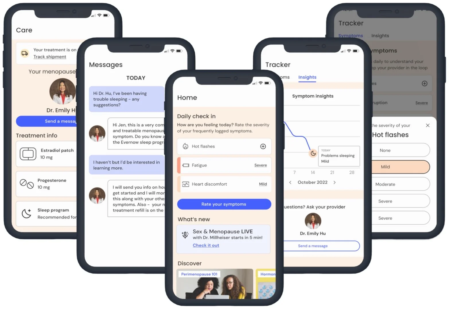
To address the feedback from our beta users that the color scheme was bland, I created a secondary color palette for the symptom tracker that complemented Evernow’s brand colors. After careful consideration, I chose a warm palette of corals that added visual interest and maintained legibility of the text and icons.
The gradation scale from light beige to darker corals served as a visual cue to users as they corresponded with the levels of symptom severity (from none to most severe). Users liked the simple icons correlating with each symptom i.e. a flame for hot flashes, so we kept this element.
Accessibility
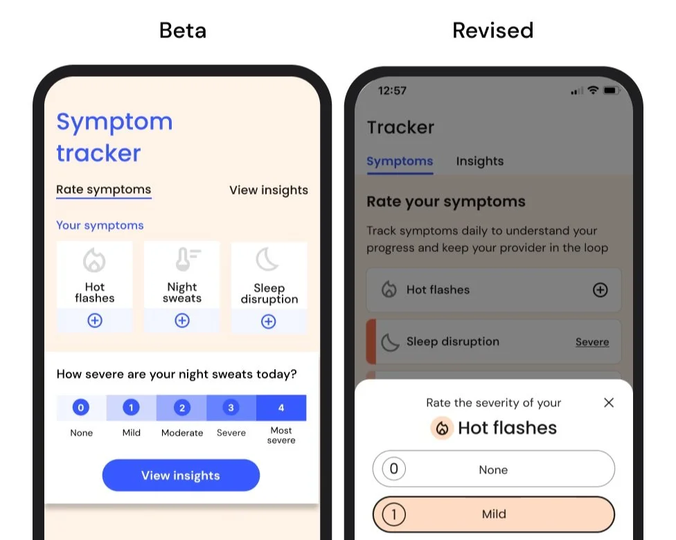
To enhance the accessibility, simplicity, and intuitiveness of the symptom tracking interactions, we increased the size of the selection buttons to ensure it was easily accessible for users with fingers of all sizes.
Enlarged buttons and chip sizes accommodate larger fingertips.
Messaging
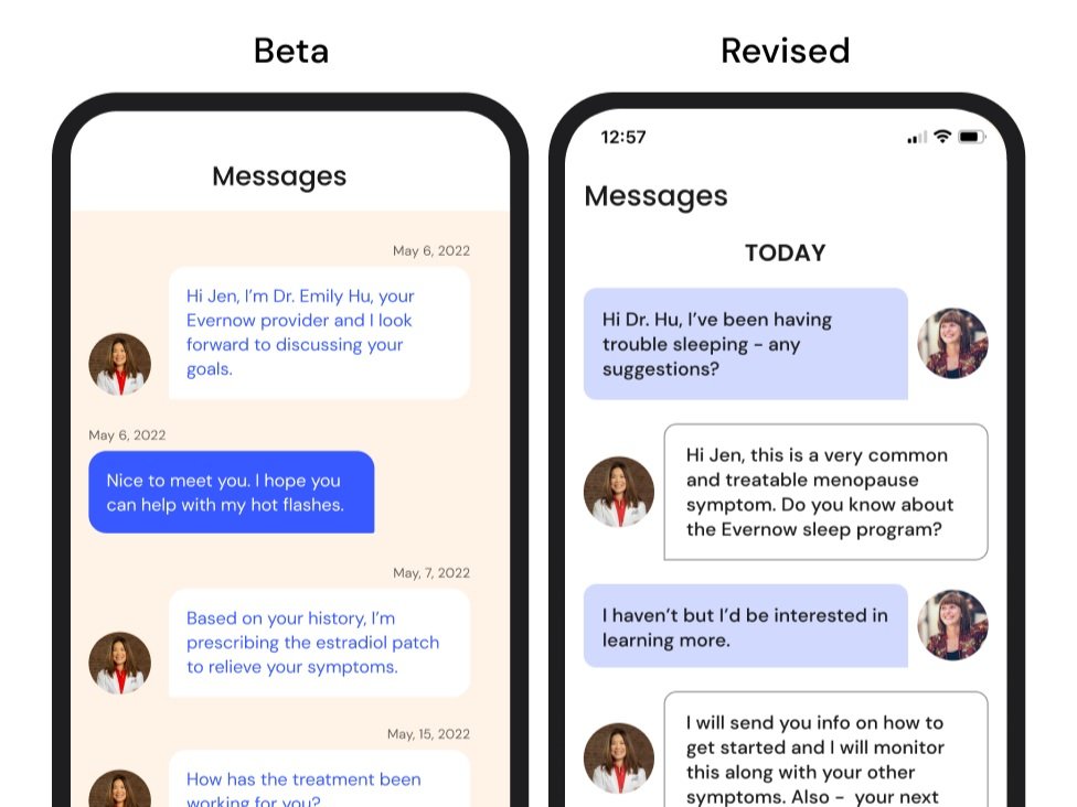
The messaging screen interaction and display mirrored common mobile UI patterns to make communicating with your provider feel effortless and intuitive.
Logging Symptom Severity
Utilizing a modal UI with larger containers and font size resulted in a simpler, less cluttered screen display, which allowed the user to focus more easily on the task and have more space to complete their selection.
Submitting to the App Store
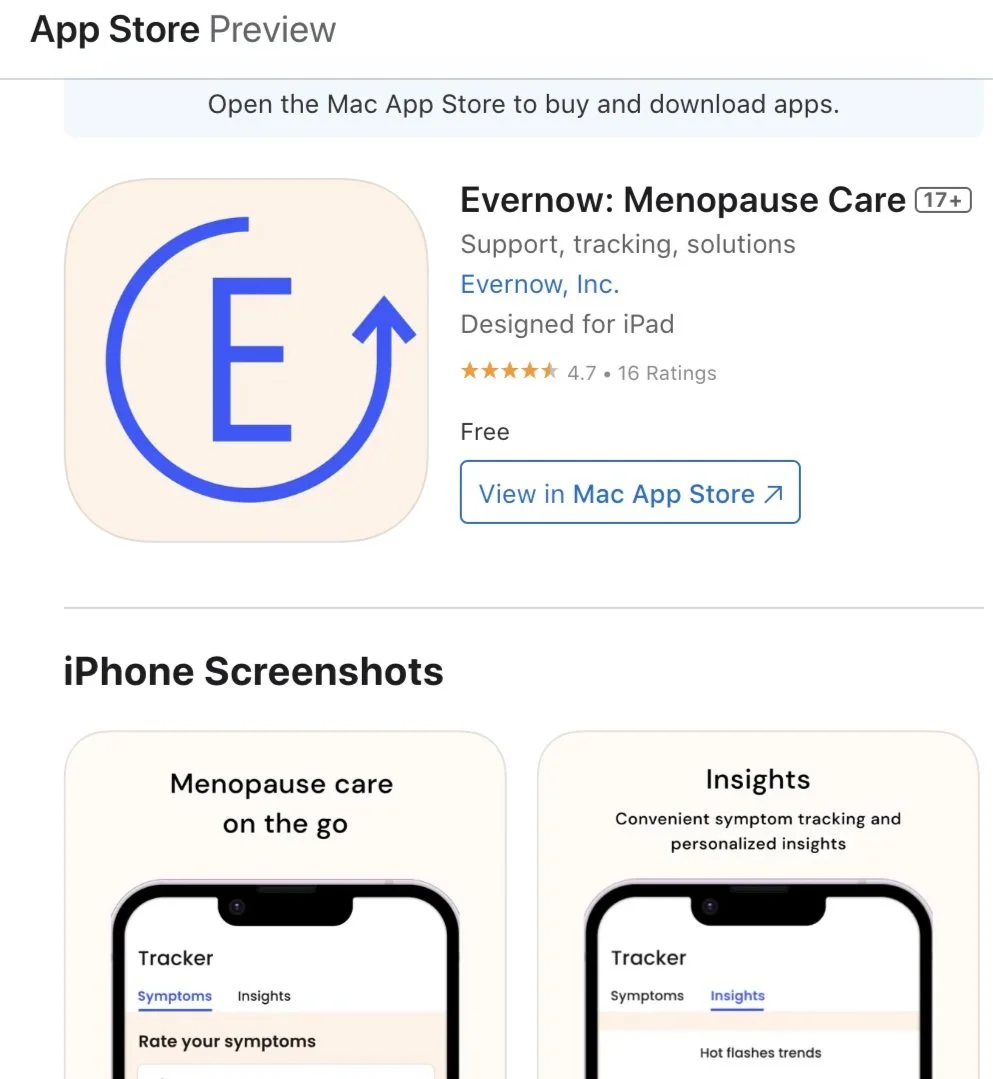
Once the app was developed, thoroughly tested for bugs and quality assurance, I prepared the necessary assets and information required for app submission on the Apple App Store, including app descriptions, screenshots, promotional graphics, and other metadata to ensure it met their guidelines, including usability, functionality, and adherence to Apple's Human Interface Guidelines.
Reception and the Road to Version 2.0
To gauge the app's impact, we conducted in-depth interviews with seven early adopters who logged their symptoms multiple times during the first month. The response was overwhelmingly positive, with testimonials highlighting the wide-reaching effects on people's lives. Here are some highlights:
Quotes from Evernow App Users
Positive Feedback
All users agreed that the app significantly enhanced their Evernow experience, highlighting its accessibility, user-friendliness, and intuitive navigation for accomplishing tasks.
The app emerged as the preferred method for accessing existing offerings, such as the care plan, and notably for messaging with providers.
Users expressed an increased likelihood of asking their provider questions, indicating that the app effectively boosted engagement.
Users appreciated the value of tracking their symptoms…but found the insights section challenging to locate and lacking a personalized feel.
Pain Points + Improvement Areas
Only track when symptoms are bad rather than as part of a daily routine.
Suggestions: Need for additional incentives to boost daily use, e.g., a period or weight tracker, gamification.
Users want daily reminders to track their symptoms. (brain fog makes it hard to remember)
Suggestion: Send users push notifications to remind them to track their symptoms.Insights were difficult to locate for most users
Suggestion: Redesign the UI and navigation to improve the prominence of the Insights tab.
Users want more personalized and comprehensive insights since each person’s menopause experience is unique.
Suggestion: Display multiple symptoms on insights screen simultaneously and present content (i.e. articles, programs, expert resources) curated for each user.
