Phase 2:
STRATEGY
Defining Problems and Priorities
Using extensive research insights and Daphne Johnson's user persona as a guide, I facilitated group ideation sessions and conducted mind-mapping exercises to generate solutions, encouraging a collaborative approach to brainstorming.
By juxtaposing user needs with the business objectives, I was able to align our efforts and consolidate the input into three key areas of focus. These focal points served as the driving force in shaping the features, flows, and functions that would take precedence in the design.
Track symptoms
Contribute to users’ overall wellbeing (physical + emotional)
Easy to use
Product Requirements
These project goals helped justify the “must-have” features when making product requirements decisions. The product roadmap below ties the features to the relevant goals, level of priority, and anticipated effort it will take to implement. This is an important communication tool and guide for cross-functional collaboration among design, product management, and engineering.
Mapping It Out
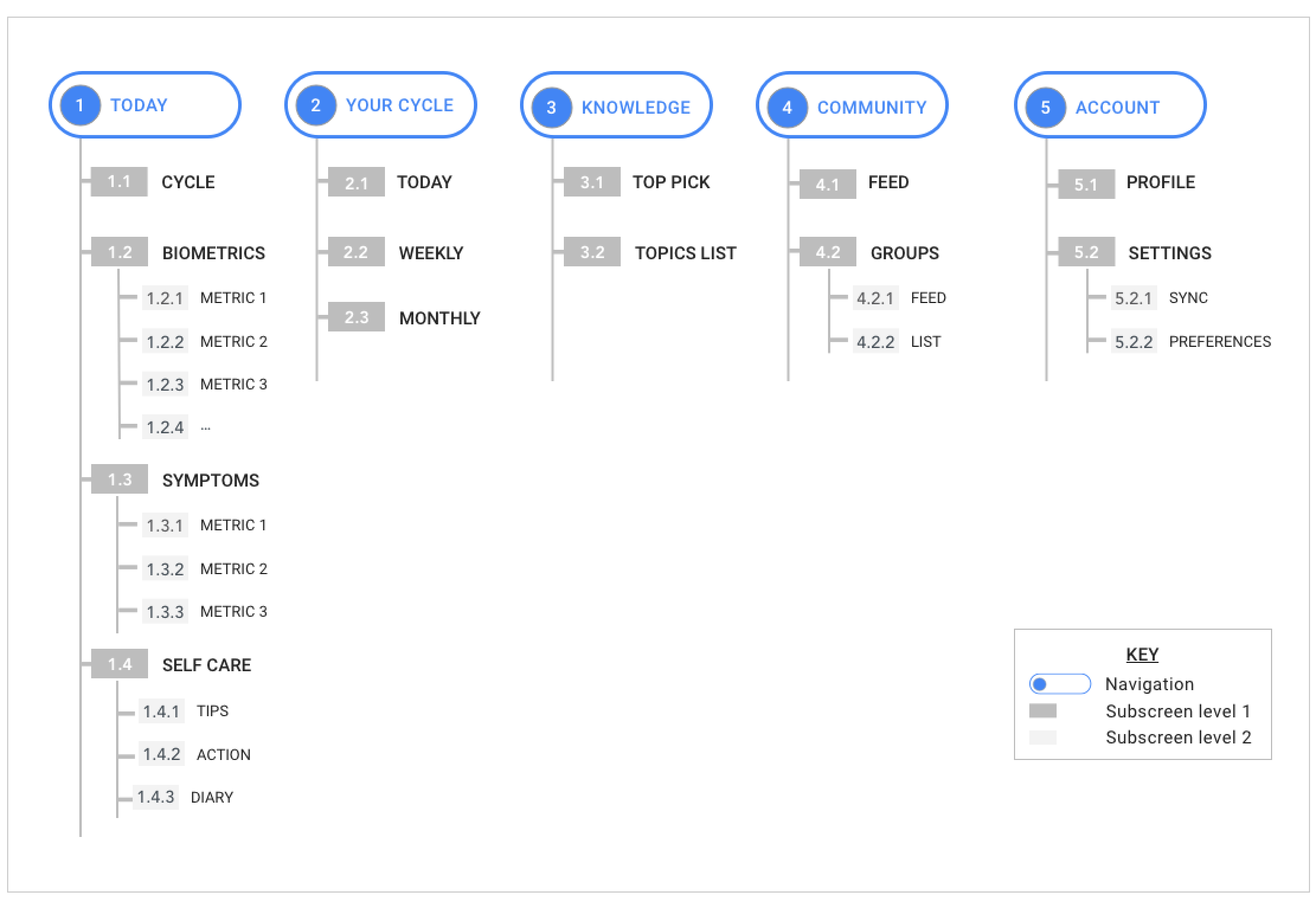
With the priorities defined, I set out to organize these features into a sitemap, which laid out the information architecture/hierarchy of screens and features in a way that I believed the user would find intuitive and logical.
User Interaction
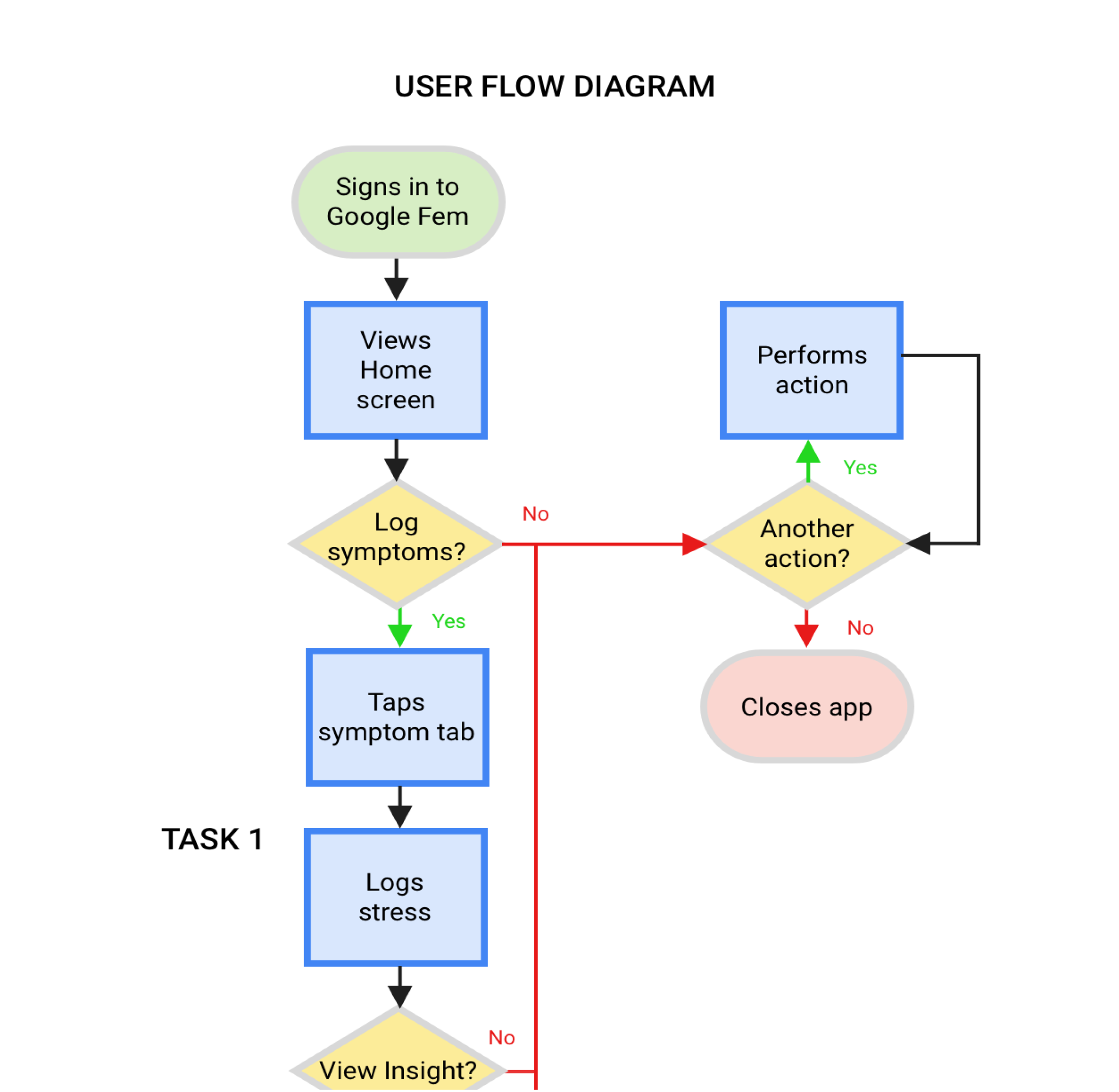
With the information architecture in place, I began to visualize how the user would interact with the different features of the app. I crafted task flows to illustrate how a user might navigate through the app given different scenarios, and user flows which include decision making points, which take into consideration what Daphne might be thinking and feeling as she interacted with the app.


