Phase 3:
DESIGN
Ready, Set, Iterate
With the product roadmap informing even the earliest stages of wireframing, I first sketched out some of the main screens and features.
Bringing Features to Life
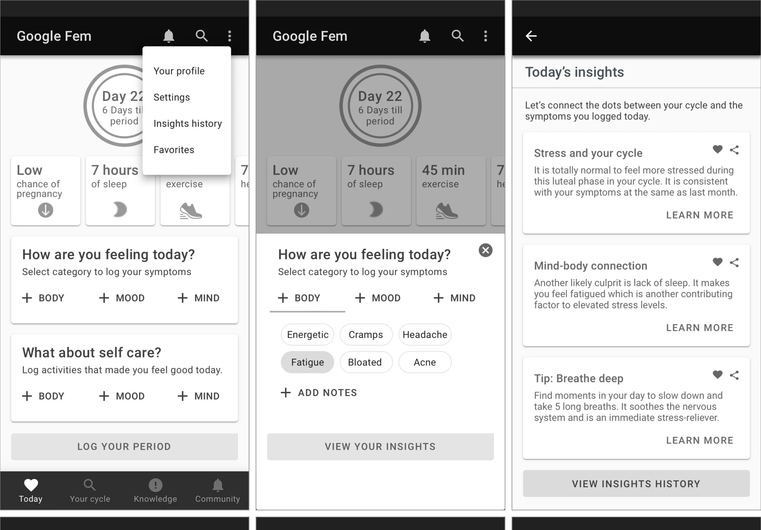
The next round of iterations were created in Sketch. These digitized (mid-fidelity) wireframes incorporated the more refined UI components and content, and were starting to look like a real Google app! I decided this was a good time to pause and get the prototype in front of real users.
I added in more section details that emphasized a holistic approach to tracking physical and emotional symptoms as well as some product requirements “must haves,” including a Settings screen.
Testing with Real Users
How User-Centered was the design?
In general I’ve found that user testing early and often is a good investment of time and resources; it helps answer some big questions about usability and functionality, and prevents one from getting too far into the weeds before validating assumptions and decisions with actual target users. It was also an efficient and effective way to hone in on the most important areas in need of improvement.
Usability Testing
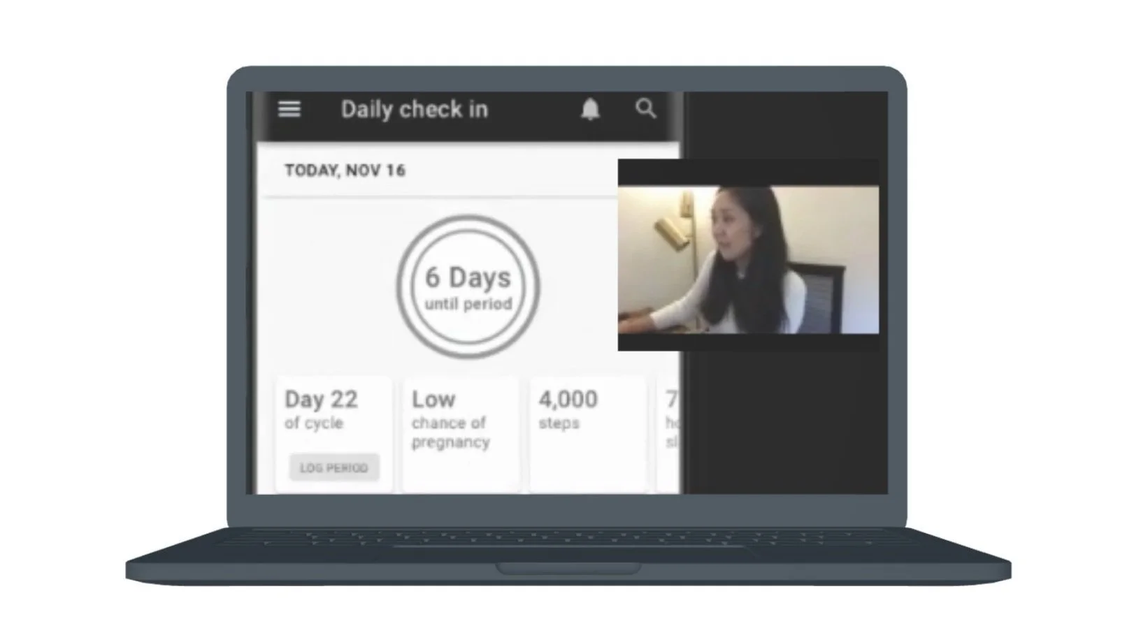
I conducted user testing with four women in their early 30s to mid 40s who were Android users. Employing the moderated, think-aloud method, participants were asked to complete a series of tasks and share what they were doing, thinking, and feeling as they interacted with the prototype while I observed their actions remotely via Zoom.
Key Questions
How easy was it to complete tasks and how efficiently could they perform them?
What errors were made and how easily were users able to recover from them?
How pleasant was the app to use?
(Screenshot of user test in progress)
Pros, Cons, Priority Revisions
Users reacted positively towards features and content like the tracker, cycle summary page, and insights feature. But I also observed that certain elements caused confusion and frustration, including the primary navigation pattern (hamburger menu) and lack of an autosave function.
By synthesizing the comments and observations into an affinity map, I was able to zero in on patterns and prioritize the improvements to incorporate into the next iteration of the design. A sample of our post-user testing revisions are shown below.
UI + Google Material Design
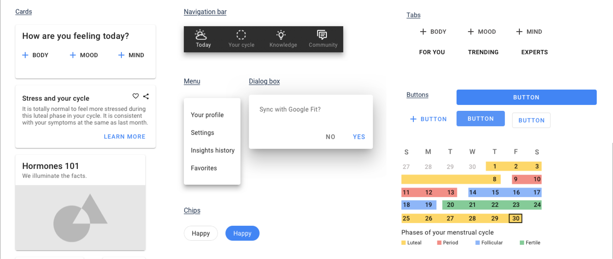
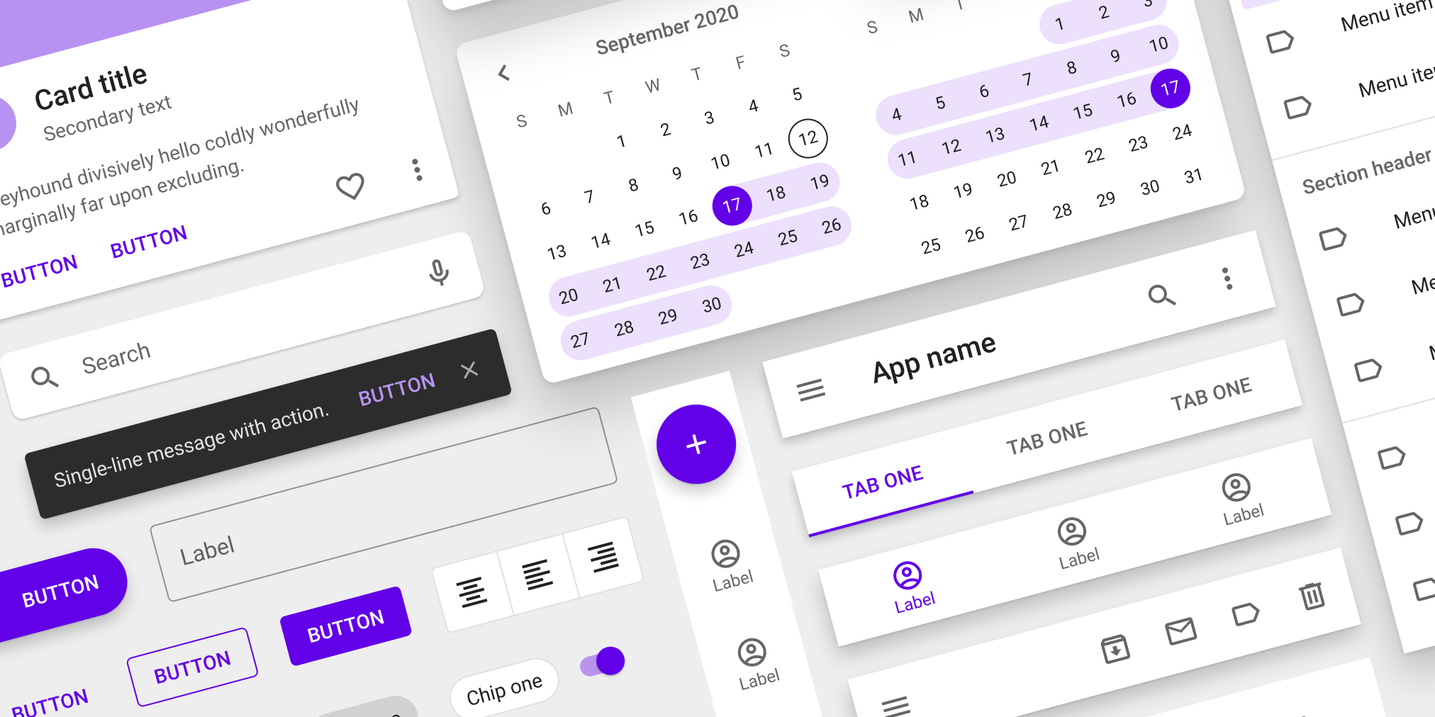
Since the goal was to create a new Google product, understanding Material Design guidelines was a critical phase of the project. I experimented extensively with Material Design’s UI patterns and components that I felt would be most effective for key user tasks (e.g., cards to display important content and functionality and modals and chips for symptom tracking, and toggles for on/off settings).
My UI decisions were also informed by competitor research, as I referenced common elements of popular health apps and Android patterns that would be familiar and intuitive to the audience (with the user persona, Daphne, in mind).
Branding, UI Design System
Visual Design and Branding
My intention was to create a brand identity that would strike a balance between the Google look and feel, including its trademark color palette and geometric style, and unique qualities that would resonate with Google Fem’s users. I anchored Google Fem’s visual style in brand attributes - Warmth, Energy, Trust, Connection - and drew inspiration from popular women’s health brands.
Design System
Once the styling elements and UI were validated by our users, I combined all of the components into a single global design system (see below). The goals and benefits of this Design System include:
1. Assist with cross-functional communication between Design, Product, and Engineering teams
2. Improve efficiency of app developers when implementing designs
3. Clarify how components and styling are to used across the app
4. Ensure that visual guidelines will be implemented consistently across all future design iterations and revisions
Presenting Google Fem!
Final Design
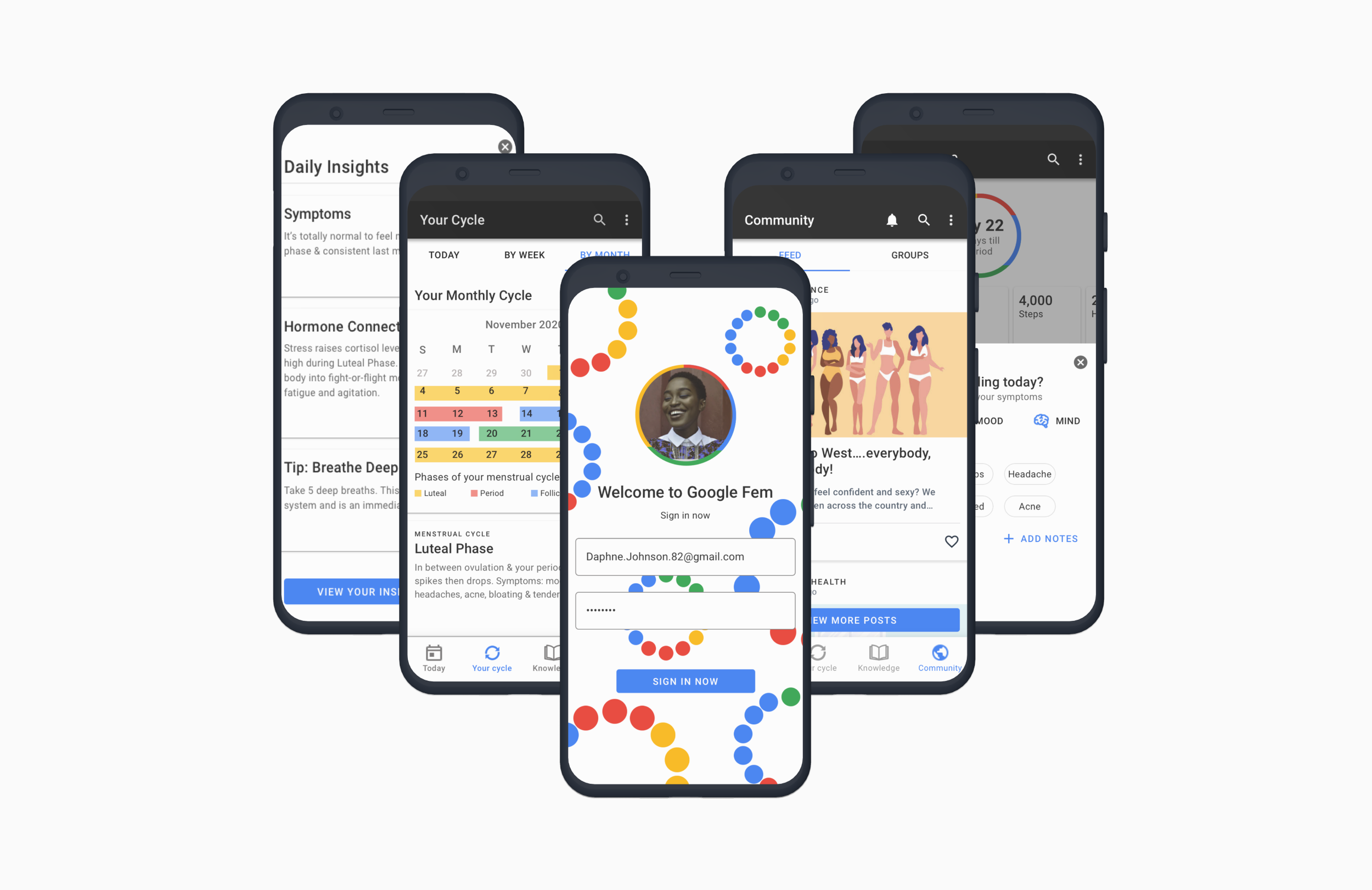
With validation from two rounds of user testing, I felt confident I had designed a valuable, easy-to-use, digital health solution for women seeking support and credible information about their health issues. The last step was to design high fidelity wireframes and a final Google Fem prototype. This was the culmination of the end-to-end design process from empathy and discovery to ideation to iteration.
Google Fem was thus ready to be presented to the client and handed off to developers for implementation.
Knowledge + Credibility
The final design incorporated additional screens and content to enhance Google Fem’s value to women seeking credible information with a Knowledge section as a main navigation tab.
Community + Connection
Additional features included a Community section to facilitate connection with others experiencing similar symptoms through groups and forums about key topics that came up during our research.

